For this task I decided to use Weebly to create my artist website as it is the 'website building' online software that I'm most familiar with.
Homepage:
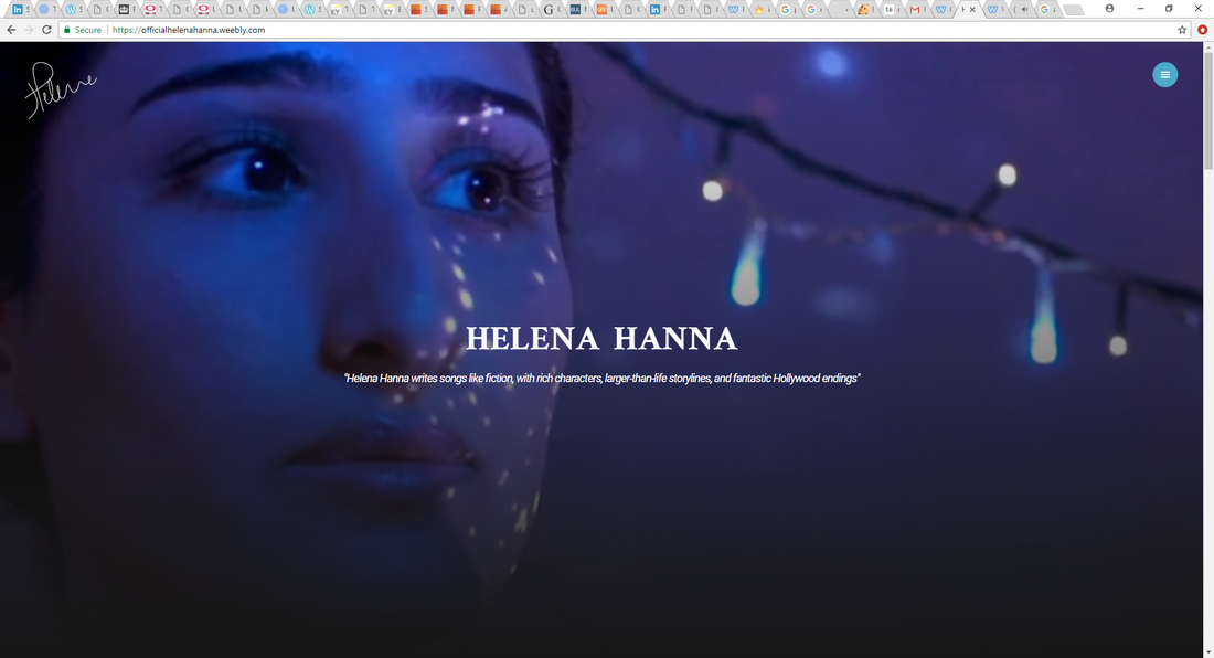
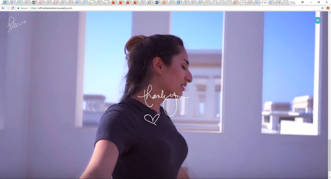
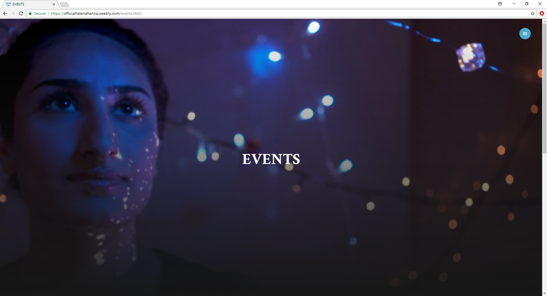
Eye-catching image will appeal to the target audience. The image will work in synergy with the music video helping it promote it as it is an image of one of the scenes of the video.
I decided to keep the homepage very minimalistic for aesthetic purposes. Top right hand corner has a button that gives the audience access to the contents page/navigation menu.
Pitch: 'Helena Hanna writes songs like fiction, with rich characters, larger than-life storylines, and fantastic Hollywood endings'. I think this pitch is really successful and will really encourage new fans to listen to her music.
On the left hand corner of every single page of the website feature Helena's autograph, which is something that fans of Helena will really like and appreciate.
|
|
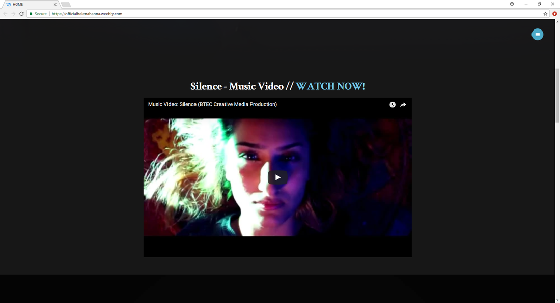
As the viewer scrolls down more information will appear, like a hyperlink to the Silence Music Video, that viewers will be able to watch from the site and won't have to open another window to watch, making the navigation easier and more enjoyable.
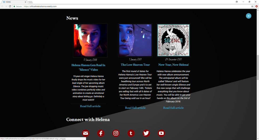
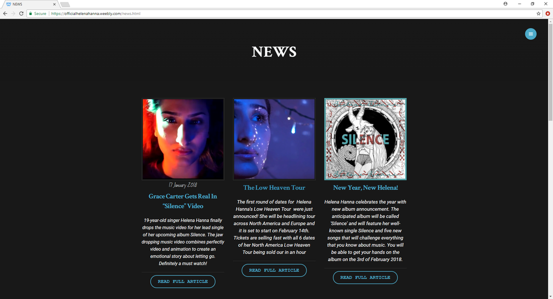
The top news of the month will also appear in the homepage, with an image and a title, a description of the news and a link to the article that will open on another window.
Links to the artist's social medias will also appear on the screen, allowing the audience to have a deeper connection with Helena.
|
|
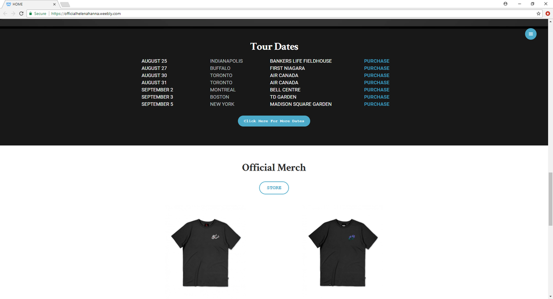
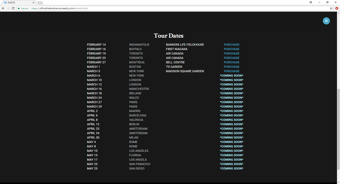
Some of the tour dates will also show up. This are organised in columns with the date, city, location and link to purchase. I placed a bottom bellow these dates to encourage the audience to go to the events tab to see further dates.
Some merchandise will also show up and a link to the store page where the viewer will have access to more products.
And finally a picture of the artist, Helena Hanna, again working in synergy with the music video. I decided to add a message from Helena saying 'thank you' as I believe it is something that her fans will appreciate and will make her website and her connection with her fans a bit more personal.
Contents Page:
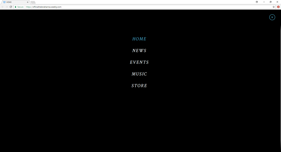
The contents page I decided to leave quite minimalistic with just the necessary information (Home, News, Events, Music and Store) it also has links to Helena Hanna's social medias at the bottom of the page.
The color palette is very dominant throughout the entire website, consisting in black, white and turquoise. This palette makes my website have a sense of unity and a strong house-style. The black and white connotes formality and professionalism as I mention in my research, and it makes my website looks put together and finished. The turquoise creates a visual pop directing the audience where to go.
The color palette is very dominant throughout the entire website, consisting in black, white and turquoise. This palette makes my website have a sense of unity and a strong house-style. The black and white connotes formality and professionalism as I mention in my research, and it makes my website looks put together and finished. The turquoise creates a visual pop directing the audience where to go.
News Page:
|
|
The News page continues and reinforces the house-style. It is layout in an organised manor for easy navigation, with a title of the article, an image, a short description and a link to the full article.
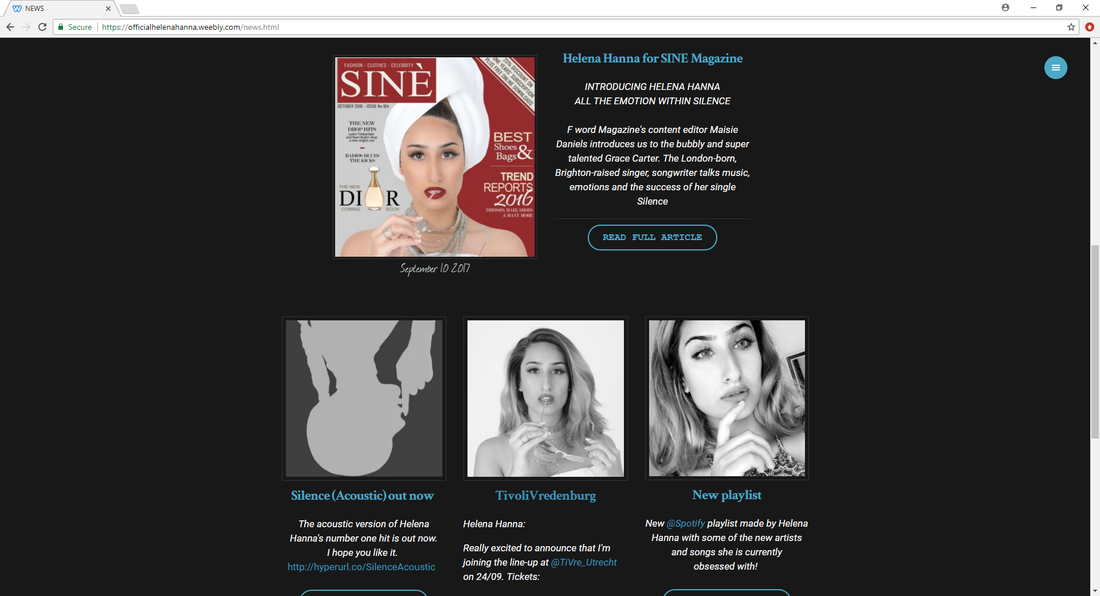
For older news/articles the images are in black and white so they don't stand out as much, as they aren't as relevant as the newer posts, and so I don't want the audience to pay much attention to it.
For older news/articles the images are in black and white so they don't stand out as much, as they aren't as relevant as the newer posts, and so I don't want the audience to pay much attention to it.
Events Page:
|
|
The events page has a similar background image as the homepage, working in synergy and promoting the album.
As the audience scrolls down tour dates will show up on their screen organised in four columns featuring the date, city, place, and purchase link to a secure website.
The events page also offers the viewer a chance to subscribe to Helene's newsletter for weekly updates.
As the audience scrolls down tour dates will show up on their screen organised in four columns featuring the date, city, place, and purchase link to a secure website.
The events page also offers the viewer a chance to subscribe to Helene's newsletter for weekly updates.
Music Page:
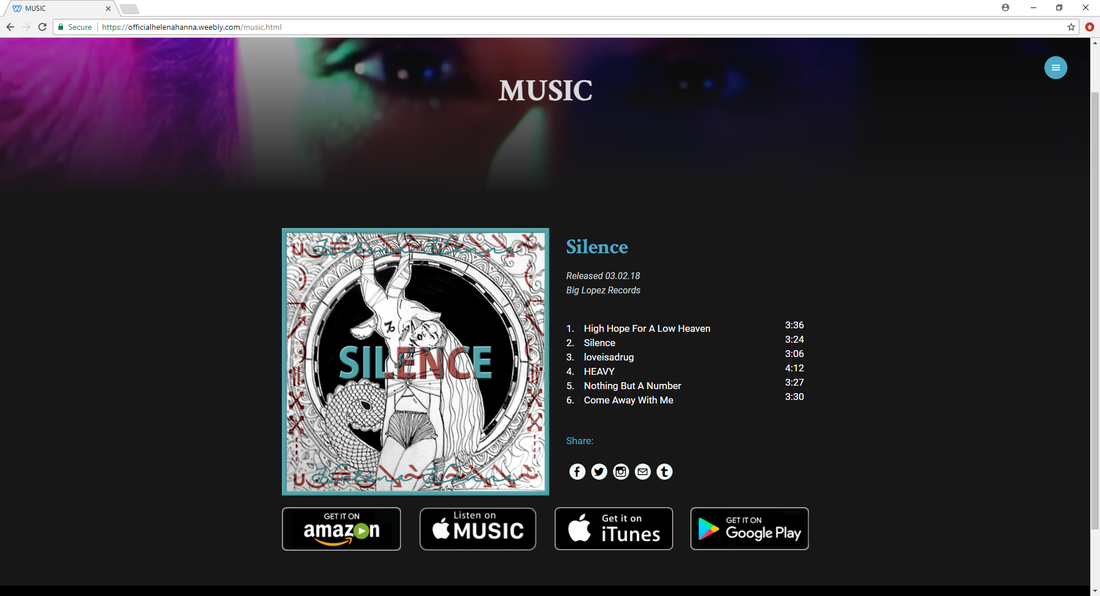
The music page features Helena's album 'Silence', providing the audience the cover art, information about the album (release date and production company), track list, links to share it on social media, and links to where can the audience buy or stream it.
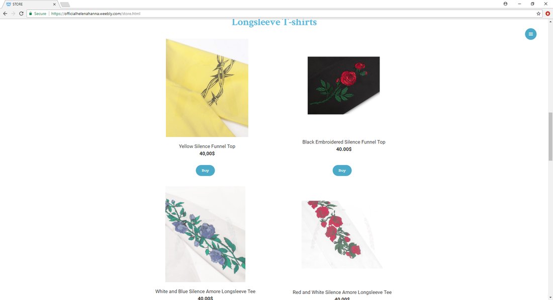
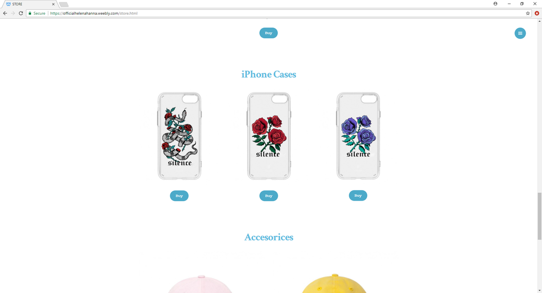
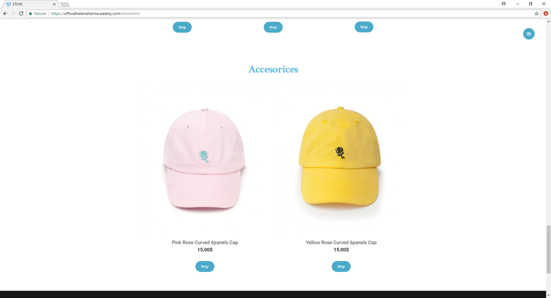
Store Page:
|
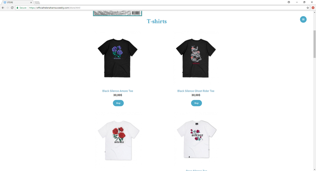
|
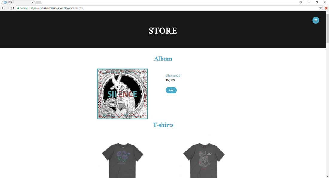
The store page offers the audience different products and merchandise they can buy.
I produced the clothing on Photoshop. I first took and image from google of a tshirt/hoodie/phonecase and then Photoshop it to match my artist brand.
I produced the clothing on Photoshop. I first took and image from google of a tshirt/hoodie/phonecase and then Photoshop it to match my artist brand.
|

|
|
|
The page offers some detail about the product, images of the product (most of the products have to images, mainly front and back), the prize of the product and a link to purchase the product.
|
|
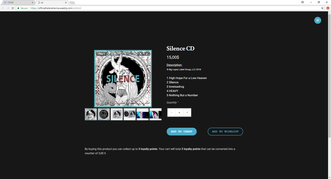
When the viewer clicks the link to to buy a product, a new window will open on their browser with the purchase page. The purchase page changes depending on what product the audience has clicked on. For example, the CD purchase page offers the audience more pictures of the product, how much it costs, a description showing the production company, the track list, the amount of CDs the viewer wants to buy and an option to add to chart or to add to wishlist.
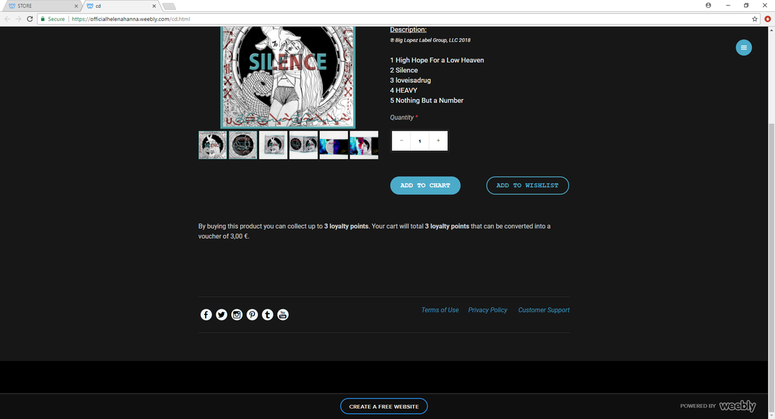
As they scroll down links to Helena Hanna's social media platforms and compulsory link to Terms of Use tab, Privacy Policy tab and Customer Support tab.
As they scroll down links to Helena Hanna's social media platforms and compulsory link to Terms of Use tab, Privacy Policy tab and Customer Support tab.
|
|
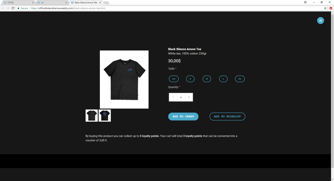
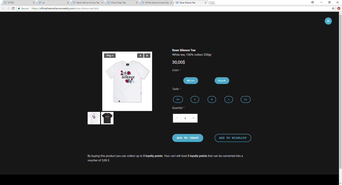
The clothing purchase pages are slightly different to the CD purchase page. It has a title, description of the product (including the material and the grams, an option to select size and quantity and an option to add to chart or to add to wishlist. For some, it also offers the viewer a choice of color.
My website offers loyalty points that can be converted into money when a customer purchases a product. This will encourage repeat purchases, increasing the chances of the new customers becoming loyal costumers and so increasing profit in the long term.
My website offers loyalty points that can be converted into money when a customer purchases a product. This will encourage repeat purchases, increasing the chances of the new customers becoming loyal costumers and so increasing profit in the long term.
