A digipack is a type of packaging very characteristic that was triumph during the last past years, and has been one of the most popular options for the launch of new projects for the music and film industry.
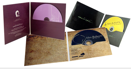
A digipack is a case/portfolio that has different layers that opens like if it was a drop-down book, this allows the product to be presented in a very aesthetically pleasing way. Digipacks are mainly made out of cardboard, in which its interior has folded trays that their main function is to hold the CD.
This format of packaging allows you to have a great variety of designs, due to the material, cardboard, allows the print of a great number of images and designs. Additionally, it allows the opportunity to hold more that just a CD, as in digipacks you can have up to five different folders.
|
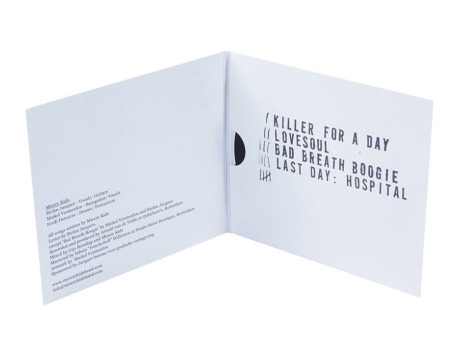
A little bit of history: The first compact discs were released mid 80s: this was a technology and a format that promised the best of the best, starting with the disc itself, It had one side only which meant there was no need to stand up and change the side; this was considered to be the main advantage for a long time. Digital sound vs analogical ensured that the disc would be able to be played as many times as wanted without it wearing out. Another obvious advantage was the number of minutes of music that the disc was able to hold. Lastly, it was a smaller format and way more manageable than vinyls, which was an advantage for both distributors and consumers. These first CDs always came in its original format with its plastic case and booklets, which normally allowed the artist to include more information, pictures, lyrics of the songs, etc. Overtime the digipack was released, instead of having the usual plastic case, distributor started to sell CDs in cardboard boxes. Since then Digipacks started growing in popularity and variety. Digipacks started developing into different types: the classic, which is the one that has the folded tray to hold the CD; the digifile, which allows to insert the CD inside an opening on the inside panel; the digisleeve, where the CD goes inside of the panel itself and looks more like a vinyl box; the digibook, way thicker and with way more panels (max5); and the A-5, a digipack almost as big as a DVD. 
A5
|
Digifile
Digisleeve

Digibook
|
Contemporary Digipacks

Front cover
|
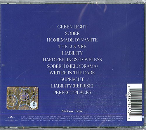
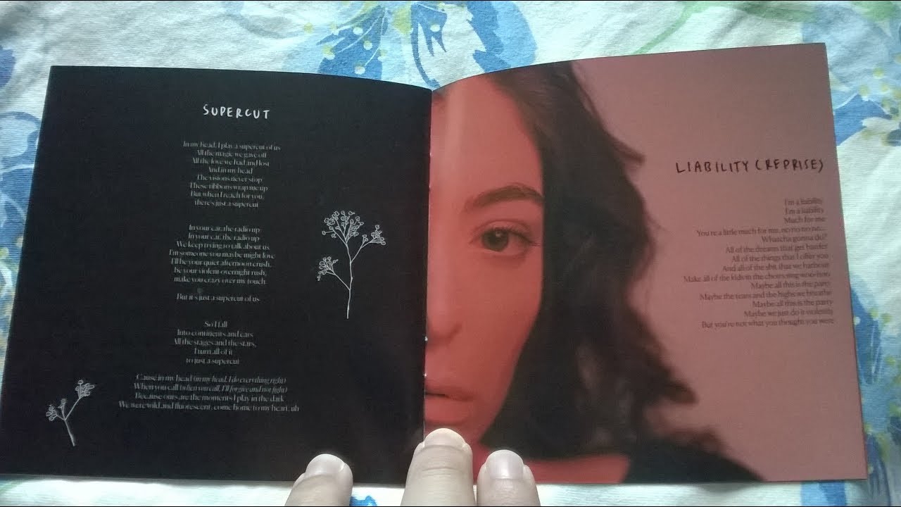
The front cover of Lorde's 2017 album 'Melodrama' is a painting by artist Sam Mckiniss. The album art has converging of two like minds and 'simpatico spirits'.
The vibrant color palette creates a great mixture of contrasting colors working in synergy with the great mixture of emotions the lyrics of the songs in the album has. Her back cover is really simple, however, I think its really successful I believe it would have been too over the top if it had had some short of painting or imagery as it would have taken away the attention from the album cover. The dominance of the color blue suggest to the audience that the narrative of the album its going to be mainly sad.
|

|
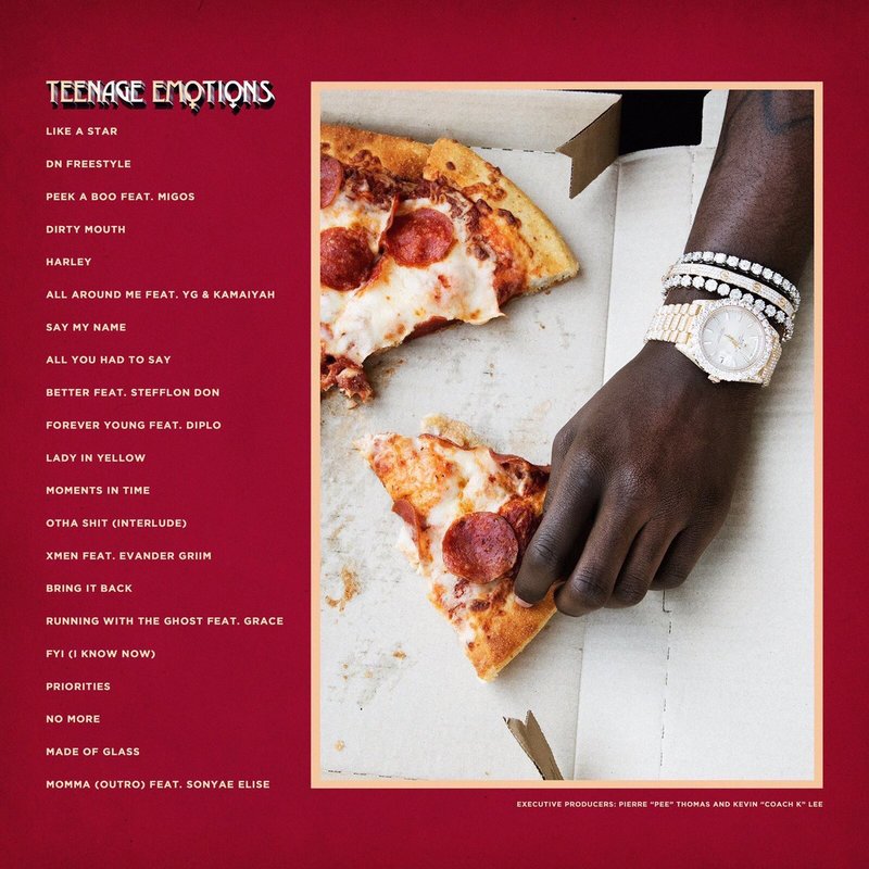
This album is called 'Teenage Emotion' by Lil Yachty, the representation of race, gender, religion, etc. is fantastic, everyone is represented in this album front cover, everyone can identify with it and I believe that is why it is so successful.
With this cover Yachty managed to stand for inclusion, and showed that no matter who you are, you have to embrace who you are and have to be proud of yourself, which links perfectly with the album's title 'Teenage Emotion' and its narrative. The back cover and inside of the digipack are really conventional and stereotypical.
|


|
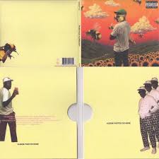
Fuck Flower Boy' by Tyler The Creator is definitely my favorite album digipack of 2017.
This digipack is so weird, specially the front cover. However, even though the painting is really surreal, its is grounded in a certain visual reality which make it really successful. The bee covering the artist page creates a sense of mystery producing an enigmatic feeling to the audience encouraging them to buy the album. The inside of the digipack is so intentionally badly made, it looks like a nine year old did it in Paint or some old editing software. However this type of badly made style is extremely popular inside Tyler's target audience, so it will definitely appeal to them and creating a comedic relief that his audience will appreciate.
|

my digipack
I want my digipack to be a digisleeve, and have to separate folders (sleeves) for the cd and the album booklet.
I want my digipack to feature real art made by an artist as I believe album covers that feature real artworks are always the most successful and aesthetically pleasing.
Click bellow to see how I developed by ideas and produced my digipack.
I want my digipack to feature real art made by an artist as I believe album covers that feature real artworks are always the most successful and aesthetically pleasing.
Click bellow to see how I developed by ideas and produced my digipack.
